
NATIONAL OCEANIC AND ATMOSPHERIC ADMINISTRATION
UX Design
Overview
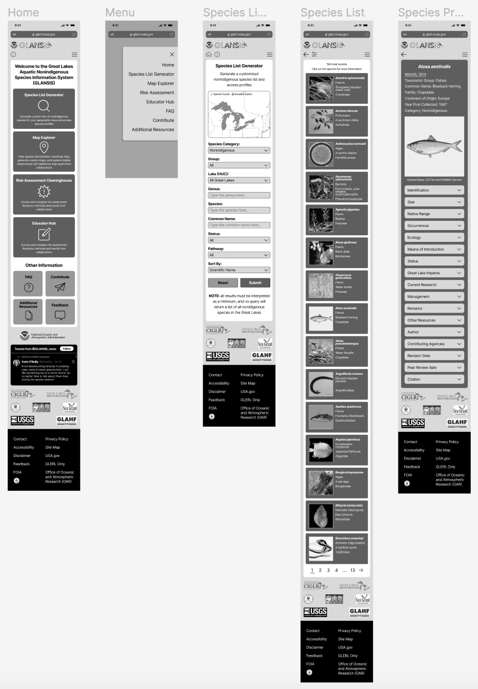
Redesigned a core feature of the Great Lakes Aquatic Nonindigenous Species Information System (GLANSIS) for NOAA over a 12-week research and design process.
Problem Statement
GLANSIS serves a wide audience, from natural resource managers to 4th-grade teachers, seeking information on 180+ nonindigenous species in the Great Lakes.
However, the Species List Generator, the site's most-used tool, suffers from:
Overwhelming content
Poor information organization
Inefficient navigation
Redesigning this page was essential to improve clarity, usability, and scientific accessibility.
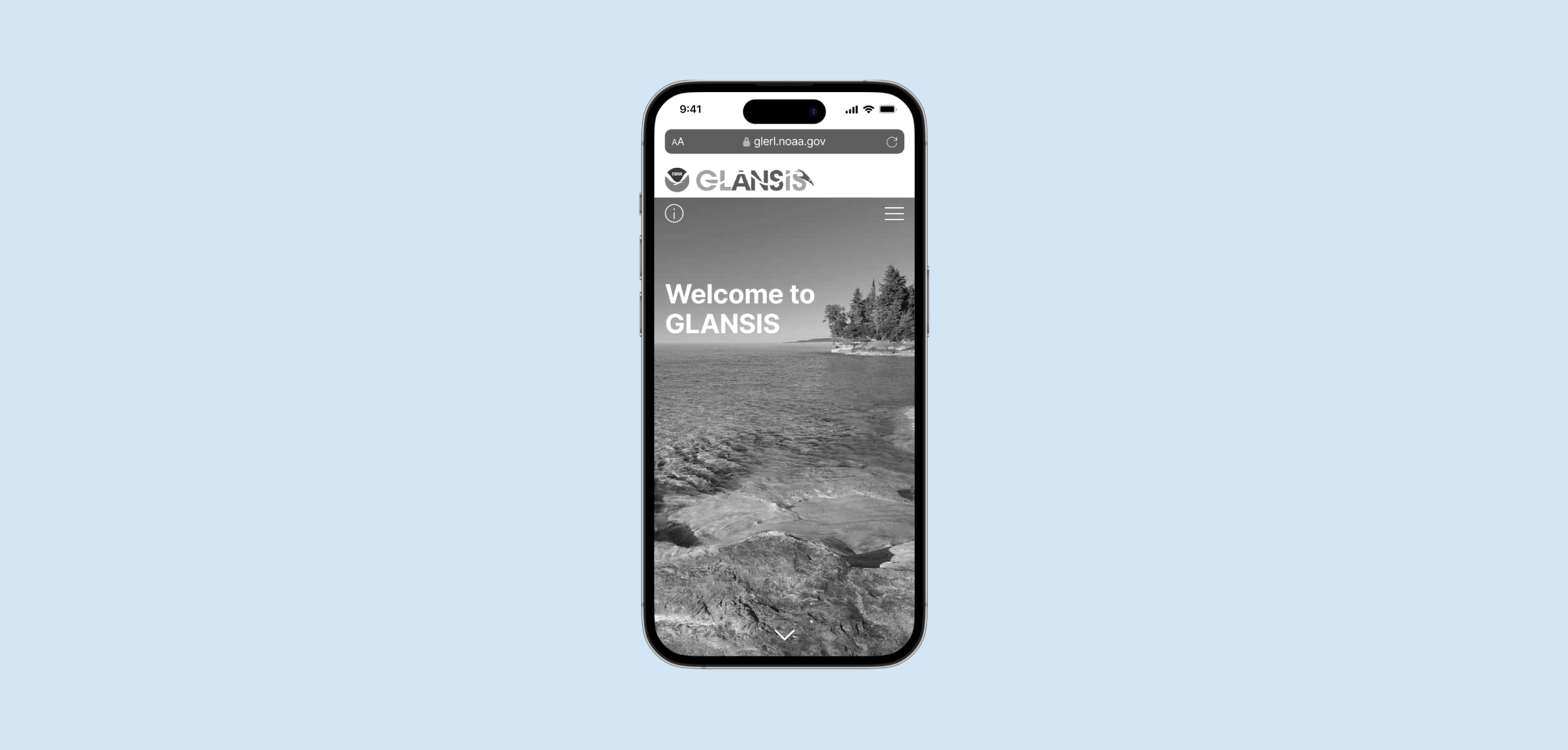
Final Prototype - Mobile
Final Prototype - Desktop


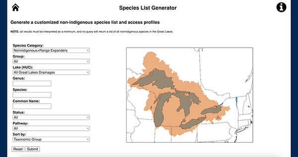
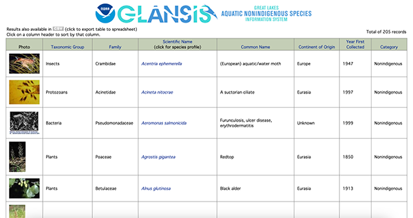
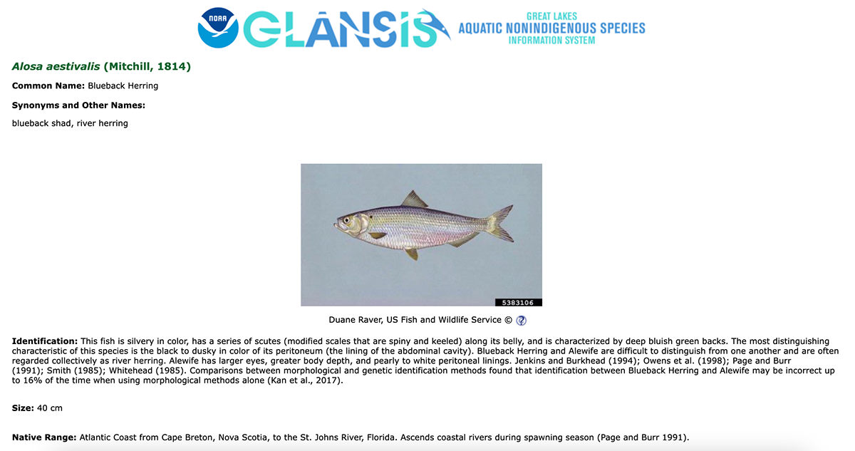
Here are some images of the original website that we were tasked with redesigning:

Early Iterations
Focused on Species List Results and Species Profile pages
Improved functionality while keeping the Home + Generator pages visually consistent
Aimed to reduce clutter and highlight key scientific details
Feedback & Refinement
Incorporated instructor and peer feedback
Introduced a more modern, intuitive visual style
Drew inspiration from contemporary interfaces (e.g., Rivian) for a cleaner, more familiar experience
Ensured accessibility for both scientific users and educators
Mobile → Desktop Adaptation
Converted mobile layouts into desktop-friendly designs
Adjusted layouts for better visibility of content without excessive scrolling
Resized search tools, results, and profile elements for smoother navigation


Final Adjustments
Refined visual consistency across pages
Updated dropdown colors on Species Profile
Added a main image to the Species List Generator for a more cohesive look with the Home page


