
CAMERON OAKS ROGERS
UX Design
Overview
I collaborated with Cameron Oaks Rogers to modernize and enhance the usability of her website, with a focus on streamlining content and bringing greater visibility to her podcast. The goal was to create a cleaner, more engaging site that prioritized ease of navigation and brand consistency.
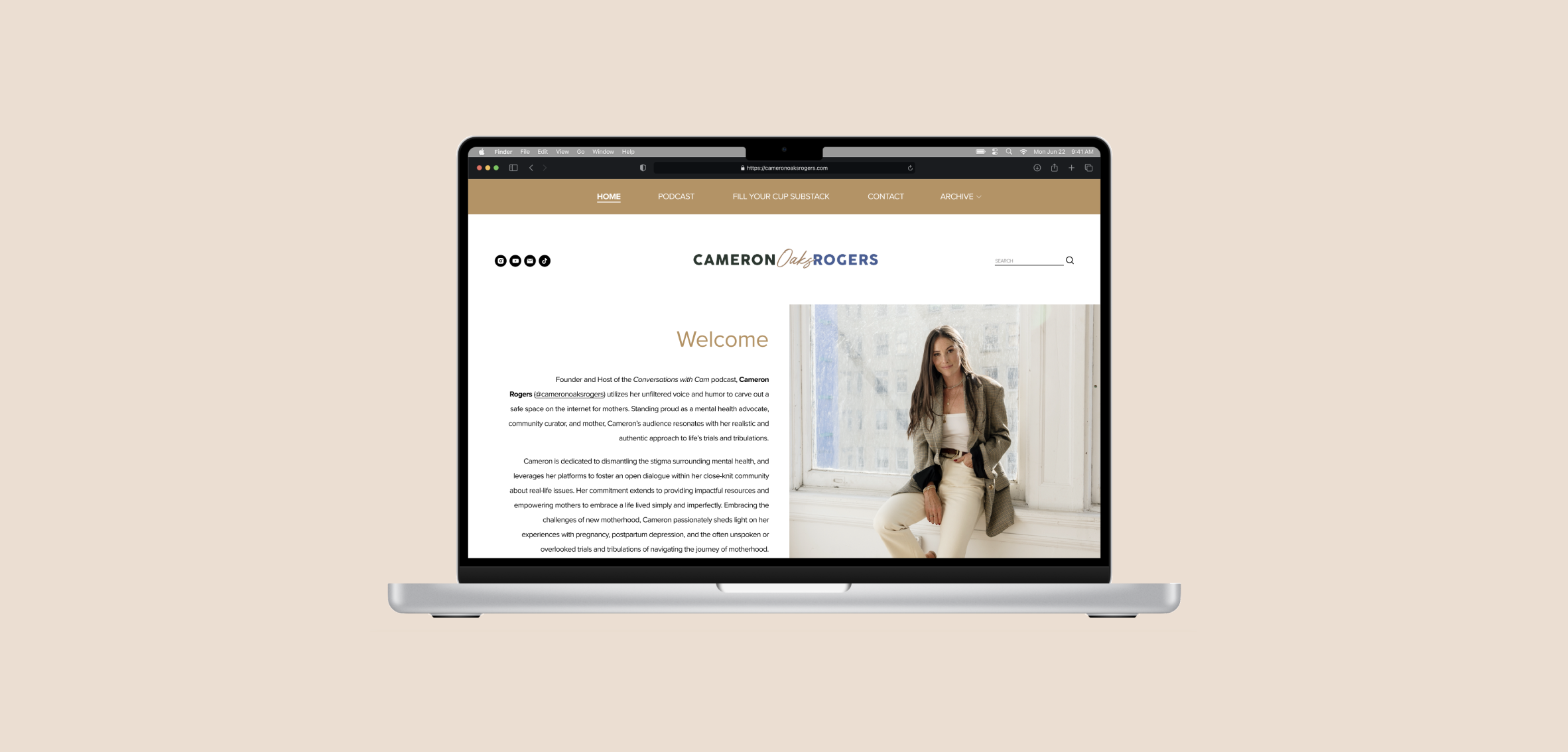
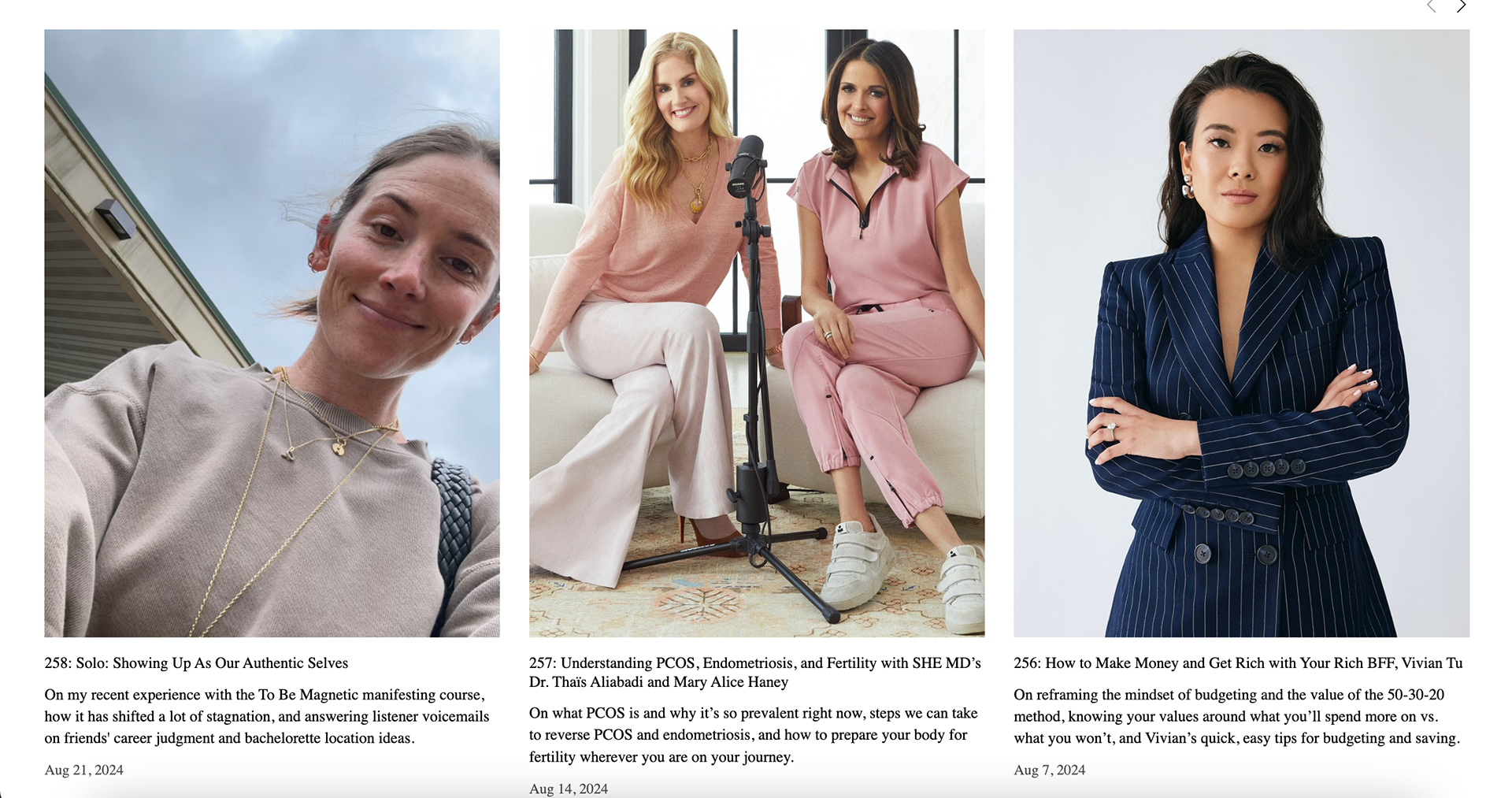
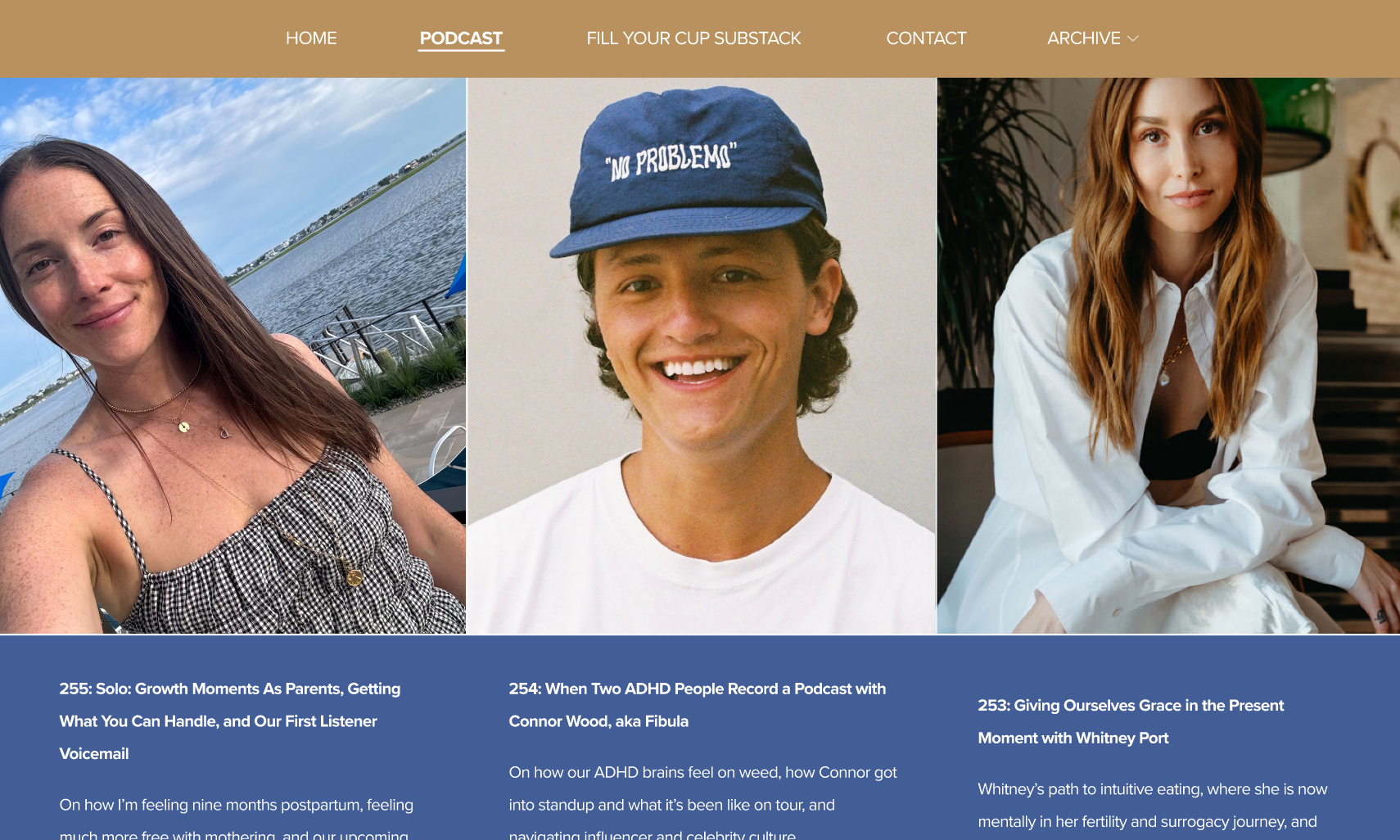
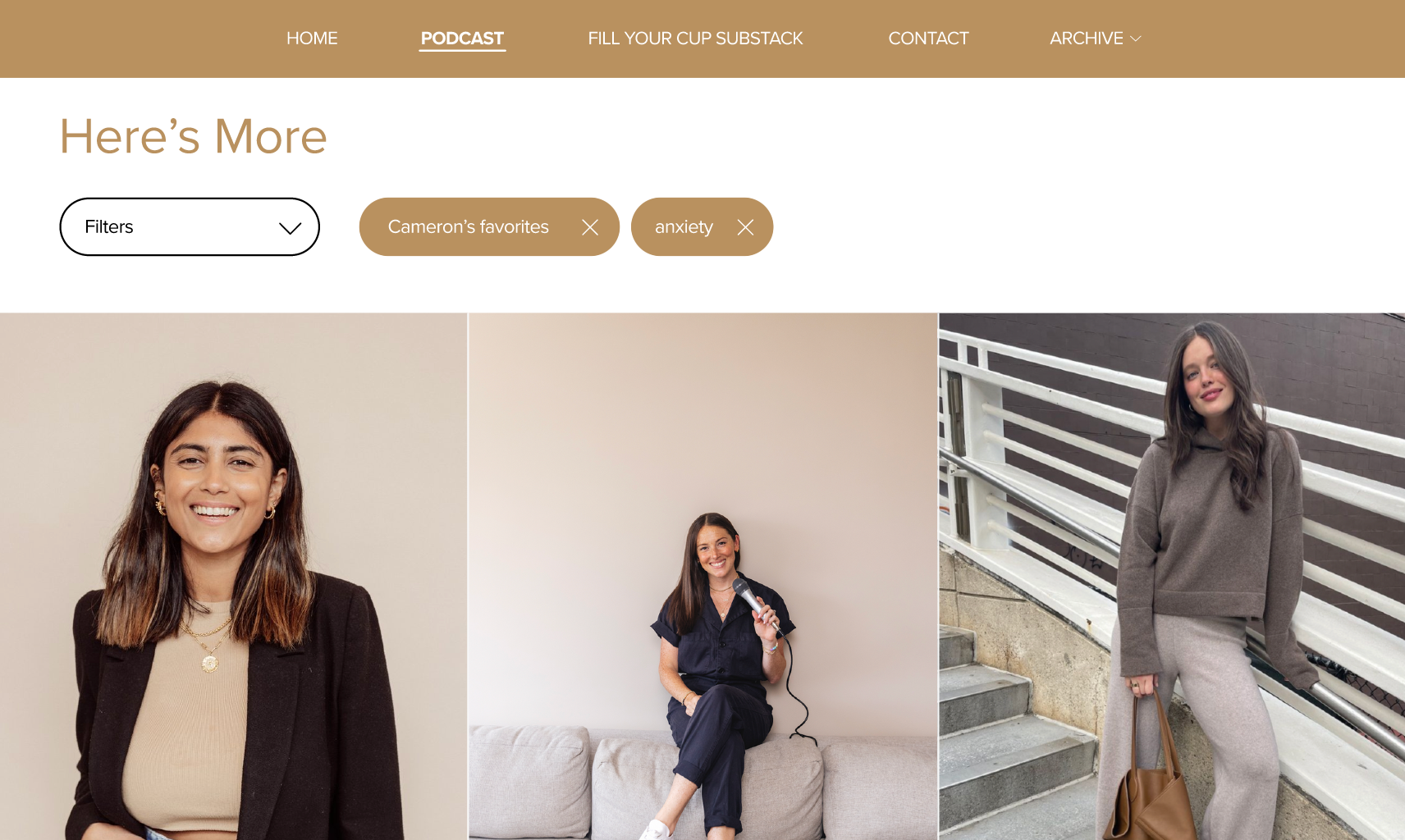
Final Prototype - Desktop
Final Prototype - Mobile
Project Scope & Initial Client Meeting
The client shared her primary goals for the redesign: highlight the podcast section, simplify information, remove unnecessary content, and modernize the overall look and feel. We discussed potential layout changes and aesthetic inspiration to better reflect her brand and engage her audience.
Based on our discussion, I developed initial wireframes that focused on enhancing visual hierarchy, integrating the podcast section into the homepage, and eliminating redundant pages. I provided two layout options—one with a contemporary sans-serif font and minimal margins, and another with a classic, structured layout.
Wireframing & Design Iteration
Comparison of previous website design (first three) and my proposed design (last three):


1. Brand & Navigation Enhancements: Enlarged the logo for better visibility and introduced a color palette inspired by the logo for visual cohesion.
2. Content Simplification: Removed the “Quick Links” page, consolidating essential links on the homepage and moving others to the "Archive" page. Streamlined site structure by merging the “About” page content into other sections, reducing clicks and improving navigation.
3. New Podcast Features: Added a prominent podcast section on the homepage to highlight new episodes and enhance visibility.
4. Podcast Filtering: Incorporated a filtering tool for podcast to improve usability for users searching for specific themes.
5. Additional Updates: Introduced TikTok links at the bottom of each page for expanded social reach, added a down-arrow for archived posts for ease of access, and optimized a responsive phone version for mobile users.
Key Design Changes
After reviewing both design options, the client selected the sans-serif version for its clean, modern look. I refined this layout, ensuring that all elements aligned with her branding and usability goals.
Final Design & Client Feedback
The final design delivered a modernized, user-centered site that emphasized simplicity and engagement. Integrating the podcast and filtering features improved content accessibility, while the streamlined layout offered a more intuitive browsing experience, all tailored to meet the client’s vision.
Outcome
Full video of the website that I was tasked with redesigning: